
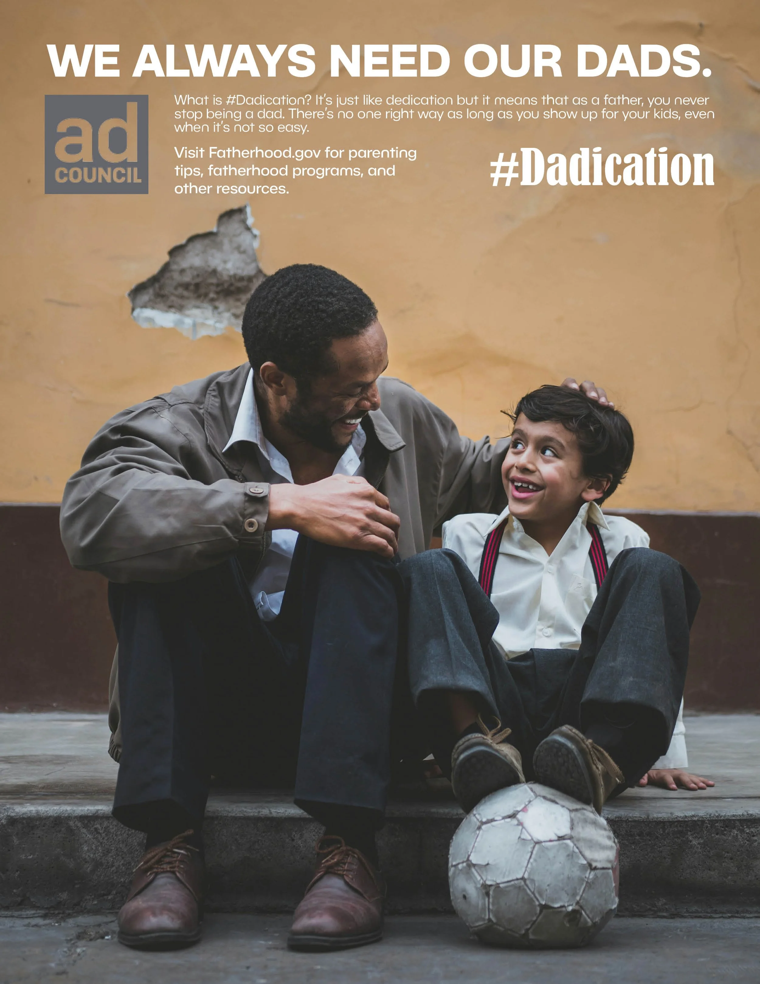
#Dadication
The #Dadication project focused on developing a cohesive public service advertising campaign that raises awareness about the importance of father involvement. Guided by research from the Ad Council’s PSA Central, the objective was to design a unified series of three ads that inform and inspire through clear messaging and purposeful visuals.
Each ad in the campaign features a simple, impactful headline, concise body copy, and supportive imagery that highlights everyday moments between fathers and their children. A consistent layout, color scheme, and typographic system were established across all three pieces to maintain visual continuity and reinforce the campaign’s message. The result is a thoughtful and accessible ad series that encourages commitment, presence, and love—values at the heart of real #Dadication.


Earth Day Posters
This three-poster series was created to promote Earth Week 2025 events at Cuyahoga Community College. The campaign centers on Pete Seeger's powerful quote about sustainability and responsible consumption, paired with documentary-style photography that captures real environmental action.
Design Approach: Each poster in the series maintains visual cohesion through a consistent typographic hierarchy and thoughtful color palette—oceanic blue, vibrant green, and natural earth tones—that reflect different aspects of environmental stewardship. The designs balance impactful imagery of community volunteers engaged in cleanup efforts with clear, accessible messaging that speaks to a progressive, socially-aware college audience.


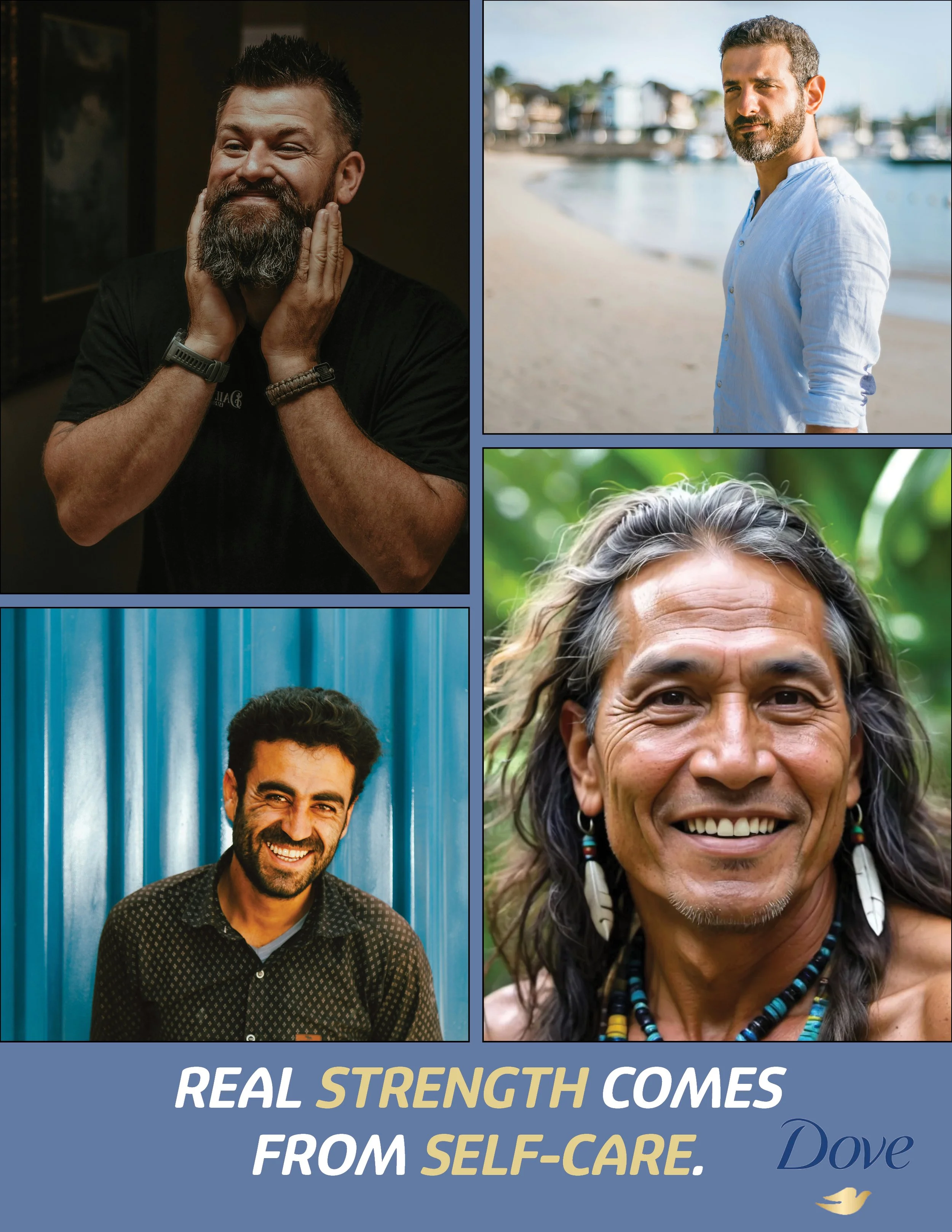
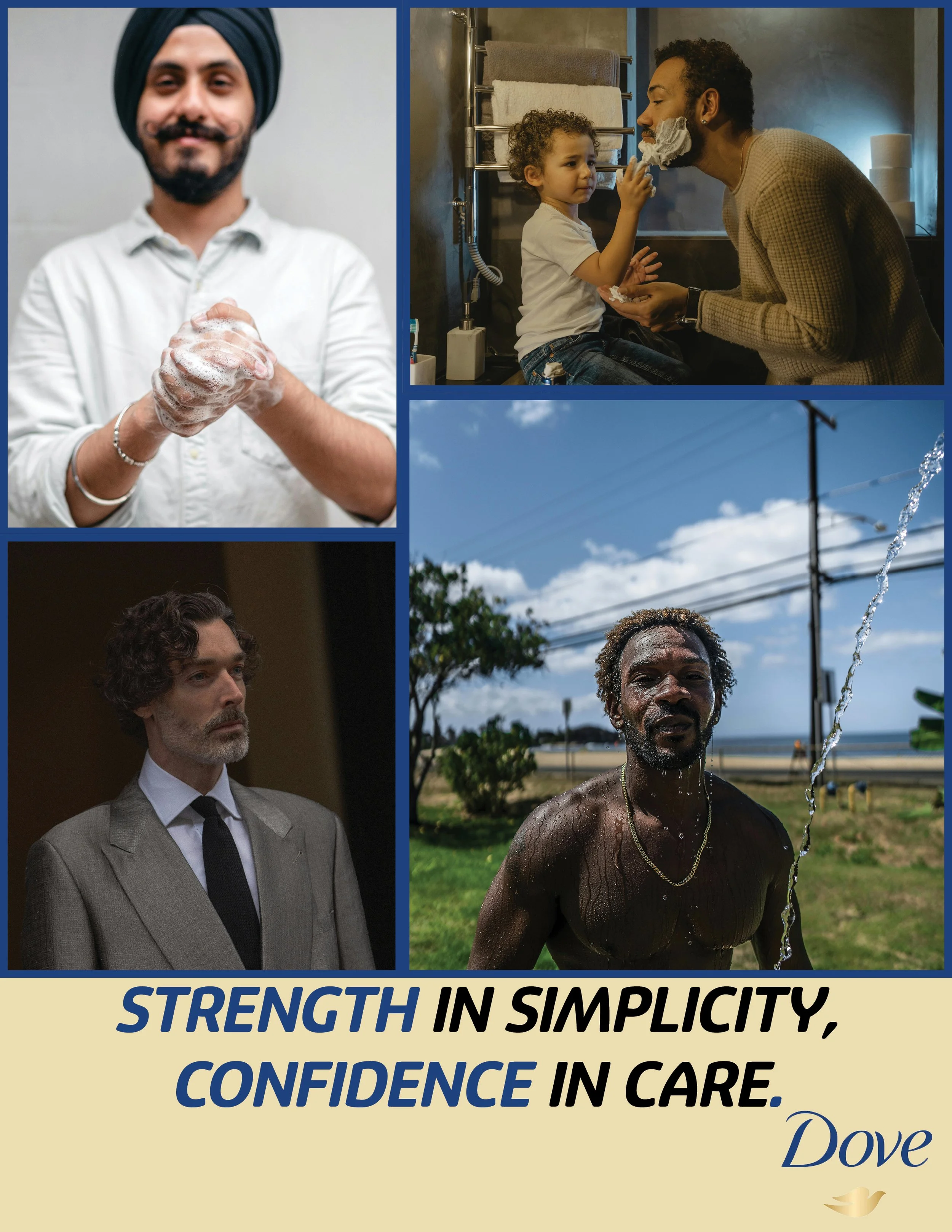
Dove’s Self-Care Campaign for Men
This advertising campaign reimagines Dove's brand presence by extending their message of gentle care and authenticity to men aged 30-50, a demographic historically overlooked in the personal care market. Through strategic messaging and inclusive visual storytelling, the campaign challenges traditional masculinity narratives by positioning self-care as an essential element of strength and confidence.
Design Approach: The campaign utilizes a bold, contemporary aesthetic with a masculine color palette of deep blues, warm golds, and neutral tones that feel approachable rather than clinical. My design strategy centers on authentic representation—showcasing diverse, real-looking men in everyday moments of self-care, from family interactions to professional settings to outdoor activities. This multi-panel layout format creates visual rhythm while allowing multiple stories to coexist within a single advertisement.
Strategic Messaging: Rather than simply adapting Dove's existing women-focused messaging, I developed original taglines that speak directly to men's experiences: "Real Strength Comes From Self-Care" and "Strength in Simplicity, Confidence in Care." These messages reframe skincare as an act of empowerment, not vanity, connecting emotional well-being with physical care in language that resonates with the target demographic.