


THE CLIMB STATION
The Climb Station is a thoughtfully designed mobile app created to elevate the indoor rock climbing experience by combining functionality, motivation, and community. This project focused on developing an all-in-one platform where climbers can seamlessly schedule classes, track personal milestones, and stay engaged with others who share their passion.
At the heart of the app is a personalized dashboard that allows users to monitor their climbing goals, log achievements, and visualize their progress over time. To foster a sense of connection and support, a built-in social feed encourages interaction, while a real-time leaderboard introduces a friendly competitive element that inspires users to improve their performance.
The interface design draws from the calming and familiar aesthetics of climbing gyms, using soft blue tones to create a sense of tranquility and mental clarity. This strategic color choice not only enhances usability but also reflects the meditative focus that climbing cultivates. Whether you're a seasoned climber or a curious beginner, The Climb Station was designed to make climbing more rewarding, more interactive, and more connected.


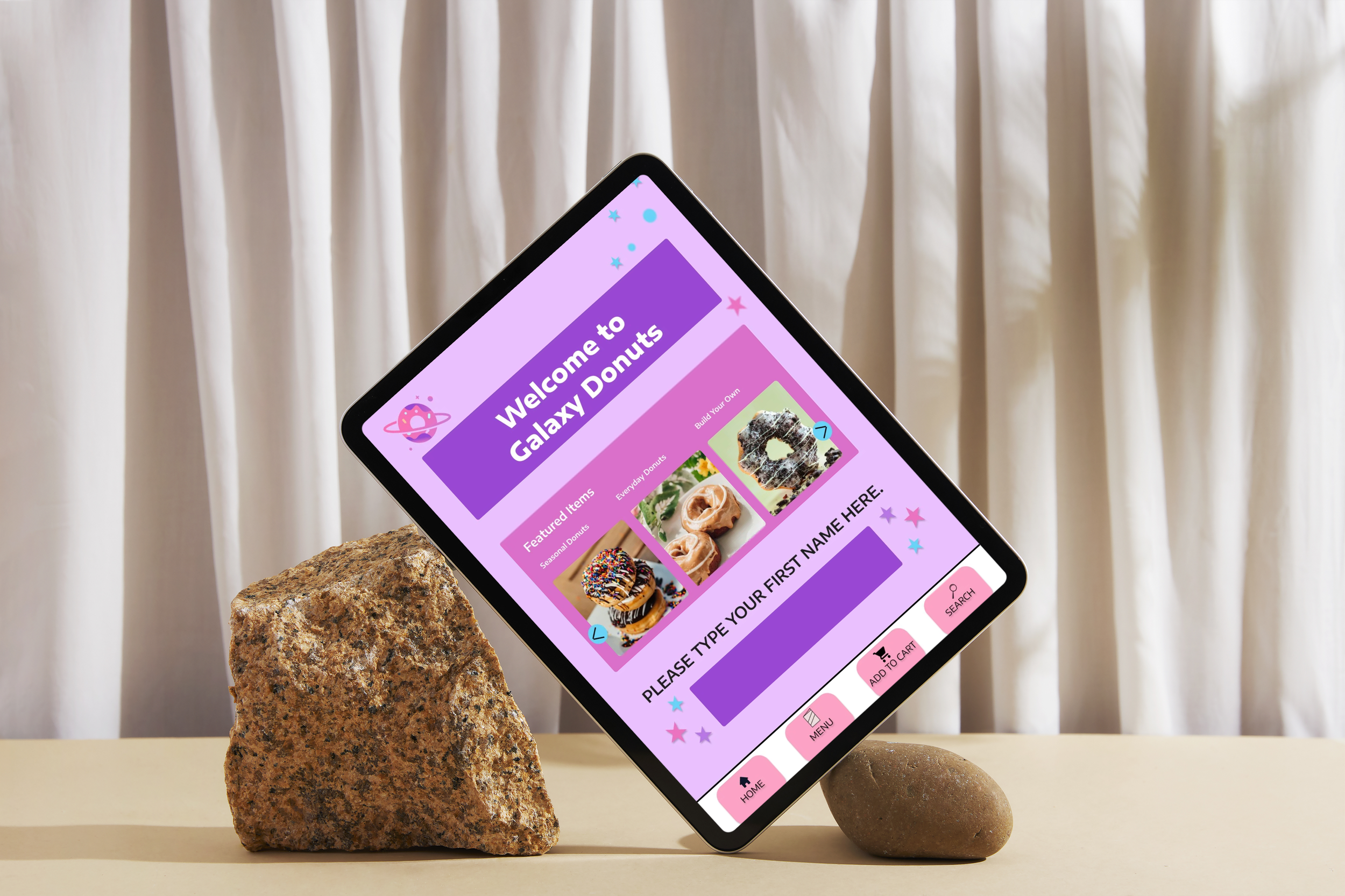
Galaxy Donuts Kiosk Design
The Galaxy Donut Kiosk Design project challenged me to create an intuitive, engaging self-service interface for a futuristic donut shop experience. The primary objective was to design a user-friendly and interactive digital kiosk that streamlined the ordering process while enhancing customer satisfaction. To begin, I developed three distinct user personas—each with different needs, habits, and digital fluency—to ensure the final design was inclusive and accessible.
From there, I designed a dynamic interface that allows users to easily browse the menu, customize their donuts with various toppings and fillings, and complete their purchase through a seamless checkout process. Key features include vibrant visuals, step-by-step customization prompts, and multiple payment options to accommodate different user preferences. The result is a kiosk experience that is both fun and functional, making donut-buying simple, satisfying, and a little bit delightful.
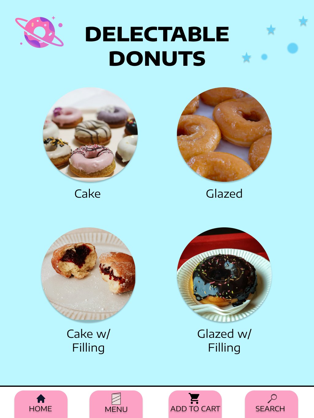

Select the kind of donut you want
Customize the donut with toppings and more

Order Details based on your cart


